Practices
10 tips on how to improve your financial product
From the #1 FinTech Design Firm in NY
In the world of FinTech, creating a financial product that stands out requires more than just robust functionality. It demands a design that resonates with users, aligns with brand identity, and delivers a seamless experience. Here are ten tips for elevating your financial product, from our team at Selma Digital, the leading FinTech design firm in New York.
1. Create a Clean, Compelling Dashboard
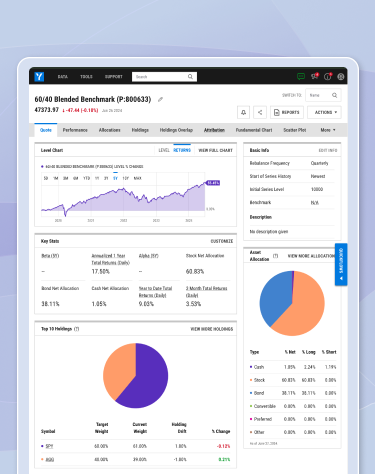
A dashboard is the heart of any financial product. It’s where users spend most of their time, so it’s essential to make it clean, compelling, and ideally, customizable. Tailor the dashboard to meet the daily needs of your audience, ensuring they have easy access to the most critical information at a glance. Information hierarchy is crucial. Emphasize legibility and the needs of your specific audience, adjusting the content organization and hierarchy based on user needs. Making dashboards customizable helps solve the problem of content organization, but customization leads to the need for a fully modular system of dashboard components.
2. Create Intuitive Workflows
A cohesive product requires intuitive workflows. Create logical, seamless processes that guide users effortlessly through the various tasks in your product. This not only enhances the user experience, but it also boosts user satisfaction and retention.
3. Focus on the Task at Hand
Removing unnecessary elements or information allows users to focus on their actual work. Whether it’s a specific workflow, data analysis, or market monitoring, consider the appropriate elements that are necessary for the task at hand. Make navigational elements or other “chrome” clean and consistent. Cluttered interfaces can distract users and reduce the effectiveness of your product. Streamline your design to prioritize essential features.
4. Prioritize Affordances
Avoid overcrowding your product with competing buttons and call-outs. Prioritize visual elements by editing and grouping them logically. This means maybe certain types of buttons with similar functions can be grouped into a dropdown. Highlight the most critical actions to prevent users from feeling overwhelmed. For example, maybe there are primary, secondary, and tertiary buttons that each have different levels of visual hierarchy. Having a complete and professionally developed design system helps your technology team prioritize affordances and create a better digital product.
5. Create Consistent Flows and Experiences
Consistency is key to an effortless user experience. Ensure that your product’s design elements (buttons, icons, and fonts, etc.) are uniform throughout. This consistency builds familiarity and trust, making it easier for users to navigate your product. Taking this idea one step further, consistent workflows and overall user experience patterns can be repeated throughout the product, making it easier to use.
6. Think About Storytelling
The design of your financial product contributes to your overall brand story. The shapes, colors, motion, and aesthetics should resonate with the brand identity and brand values. Think about how elements and forms might flow or move to create more engagement and provide deeper meaning or understanding. This way, your mission, values, and functional product intertwine to help tell your brand’s story.
7. Consider the Aesthetics of Your Charts
Charts are a fundamental component of financial products. They are not just data representations; they are visual stories. Their aesthetics should align with your brand’s sensibility to create a cohesive experience. Consider color, typography, line weight, axis style, tick marks – all of these choices add up to make your data visualizations beautiful, unique, and on-brand.
8. Color is more important than you think
Color choices in your charts are crucial, especially in relation to the rest of the UI system. They should not only comply with W3C accessibility standards but also align with your brand identity and resonate globally, as different colors have different associations worldwide. The hues you choose in your charts should also be visually distinct from one another from a brightness and contrast perspective, to make the design inclusive and adaptable for those with color vision deficiency.
9. Provide Smart Insights and Connections
Anticipate your audience’s needs by connecting the data you’re presenting in insightful ways. Think about contextual information that could be relevant and helpful to continue your customer’s journey. Enable customers to dig deeper into information via tables or data visualizations. Pair information in ways that make sense for your customer’s needs at the moment. Are they in a rush? Make the information clear and brief. Do they have time to research and dig deep? Provide more content and opportunities for exploration.
10. Save Your Customers Time
In the financial industry, time is a valuable commodity. Design your product to save users time by simplifying processes and reducing the number of steps required to complete tasks. Every click counts. Efficient design leads to higher user satisfaction and loyalty.
Conclusion
By considering these ten tips and implementing the suggestions, you can enhance your financial product’s design and ensure it meets the needs of your audience and stands out in the competitive FinTech market.
At Selma Digital, we combine creativity, innovation, and a deep understanding of user needs to deliver products that help our customers stand out and win market share. If you’re searching for a partner that can collaborate with your organization to take your FinTech product to the next level, reach out.


