HR Empathy Training: Identity Design and MVP Product Design
Translator came to us with a vision to develop meaningful diversity training for B2C businesses, Heads of HR, and Diversity and Inclusion Officers.
We helped bring that vision to life by creating a visual identity system that maintains gender neutrality and fluidity, while also capturing individuality through color and photography. We created a powerful and anonymous digital app experience accompanied by group sessions with experts to drive storytelling and conversation.
How did Selma Digital approach the brand identity?
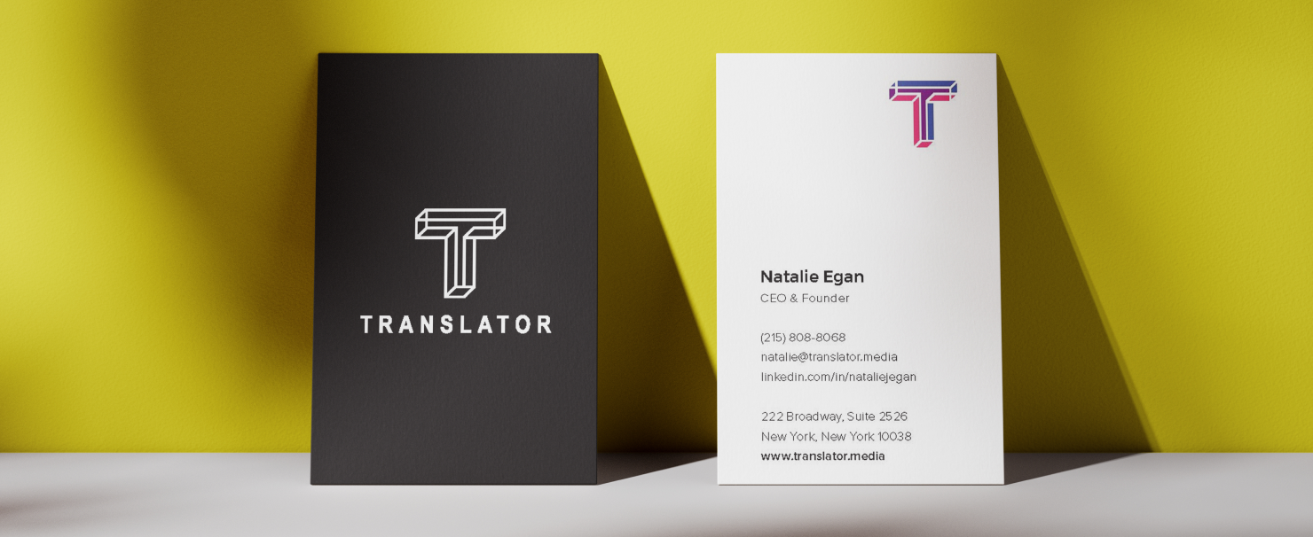
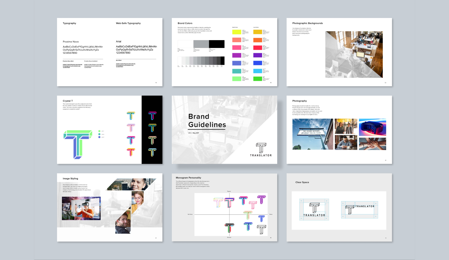
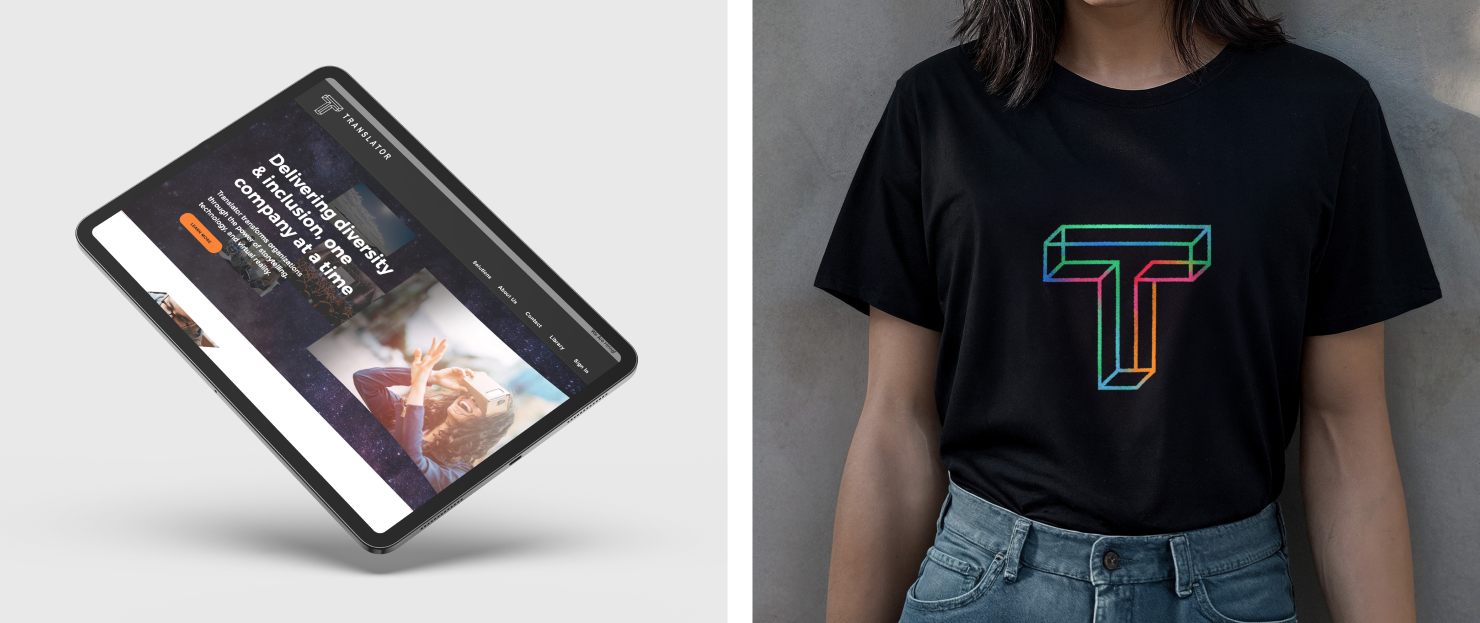
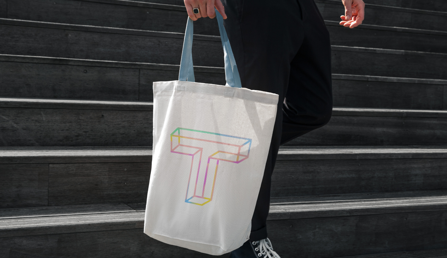
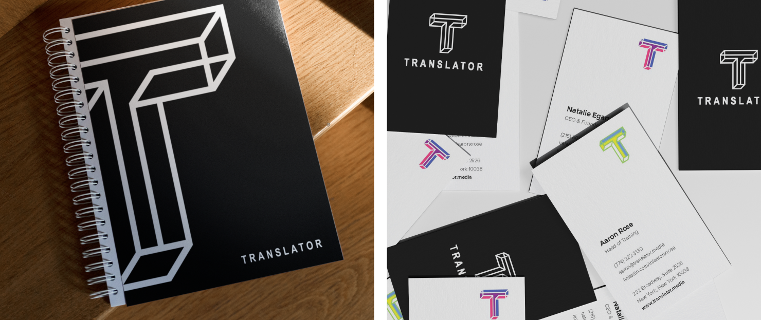
Translator as a brand is forward-looking, authentic, and confident – it’s not just one identity, shape, size, or color. A key consideration in developing their branding was the use of color. We were very conscious of any biases around the use of traditional gendered hues. Color, and identity around it, became the cornerstone around which the final brand identity was conceived. The logo manifested as completely customizable, so every employee at Translator could create their own “T” mark with the colors that they felt represented them.
The architectural “T” design emphasizes its positive and negative space, along with being a flat, yet 3D shape. With one logo mark, we were able to visually communicate a multi-faceted brand that aims to represent a world where we can all be different, but exist harmoniously.
How did the digital experience increase empathy and connection for participants?
Translator aims to help companies increase employee engagement through interactive diversity education, virtual reality, and on-site facilitation. We collaborated with stakeholders at Translator to create an educational framework that coupled digital experiences with group learning sessions. Partnering with experts in diversity and inclusion who helped to tie in real life stories, we created a series of in-person guided sessions where the app allowed the audience to participate and respond to the group session in real time, but anonymously. When the group’s responses were projected to the room, the interactive experience added moments of honest reflection and authenticity for all participants.
How was virtual reality incorporated into Translator’s toolkit of resources for the DEI community?
The team explored incorporating different storytelling techniques for individuals to “walk in another’s shoes,” so-to-speak. The hypothesis was that allowing a viewer to act in the world but in a different body, and see if they were treated differently in this virtual environment, might create empathy or awareness for ideas that are taught very quickly through experience. We also explored mobile applications that facilitated DEI education through more traditional audio and testing techniques.

