Building a legacy brand for mass timber construction
Metropolitan Timber is a Walters Group Company that handles the full lifecycle of large-scale mass timber builds, from design assist and digital modeling through prefabrication, logistics, and on-site support. They don’t just supply materials. They absorb complexity so their clients can build with confidence.
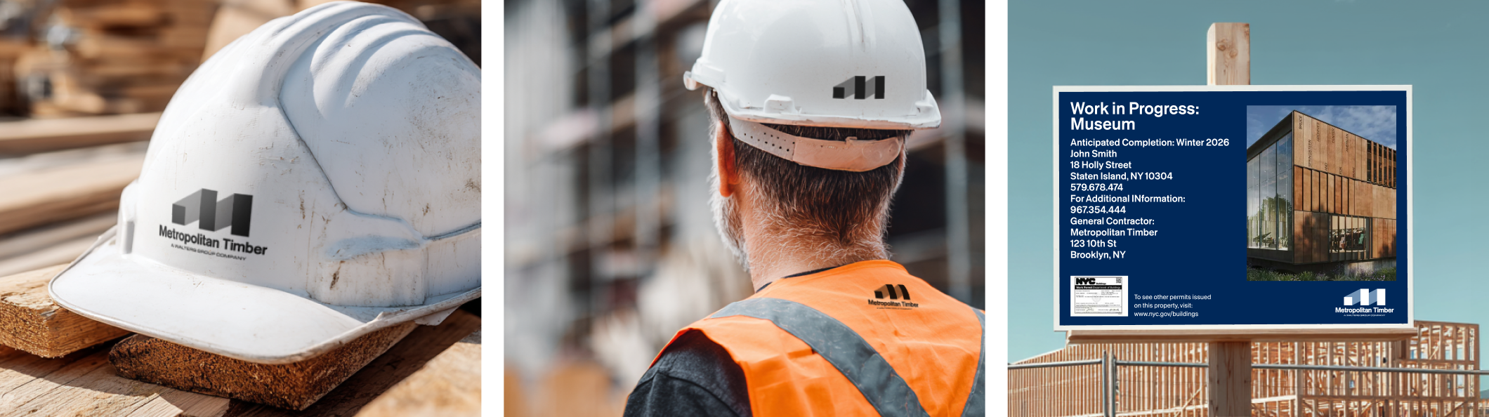
As the company positioned itself as a category leader in sustainable urban construction, they needed a brand that reflected who they actually are: reliable and determined, but also genuinely approachable. A brand that could live on a boardroom presentation and on a hard hat at a job site in midtown Manhattan.
The foundation
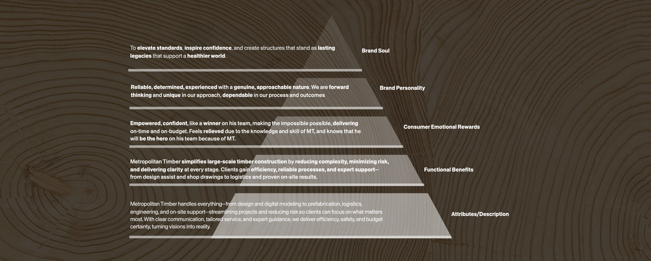
Before any visual decisions, we worked with the team to get clear on what Metropolitan Timber stands for. Their work is technically demanding and logistically complex, but the real value they offer their clients is something simpler: certainty. The confidence of knowing the project will be delivered on time, on budget, and to spec. That idea became the foundation for everything else.
We framed the brand around the concept of legacy: structures that outlast trends, relationships built on trust, and a team that takes pride in the permanence of what they make. That positioning shaped the visual language from the ground up.
The mark
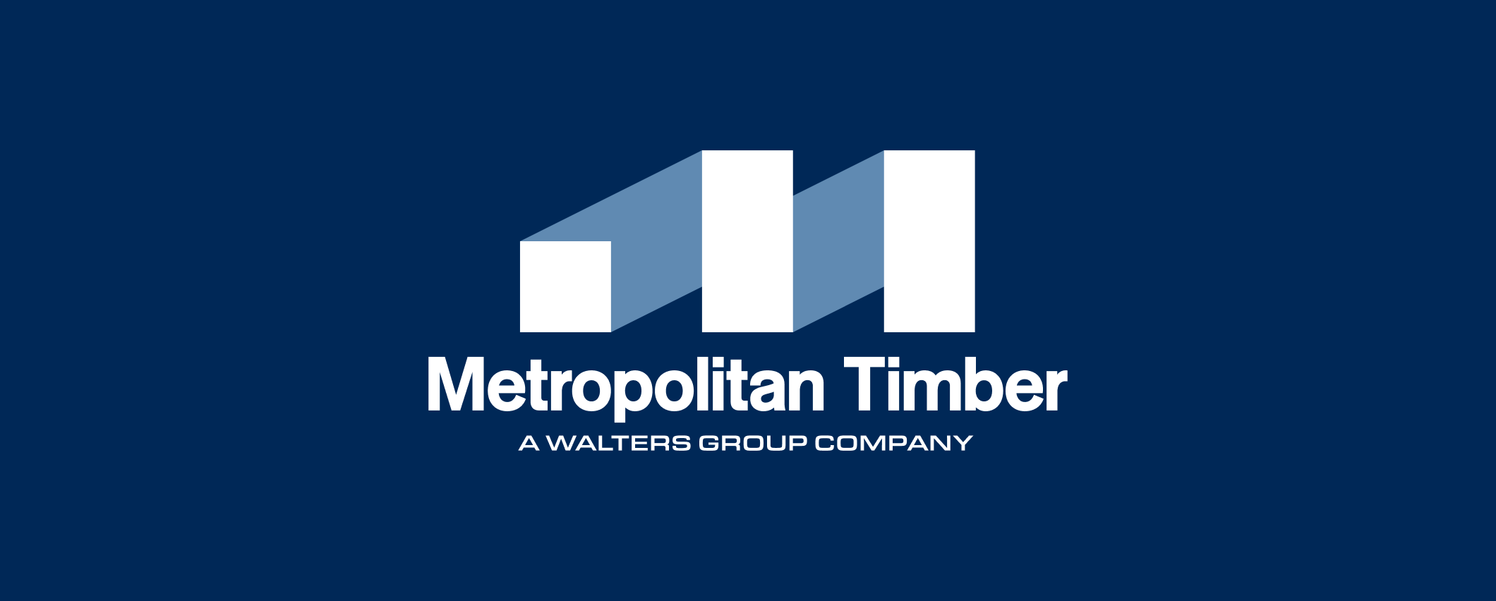
The mark draws from the modular geometry of timber blocks: three ascending forms connected by diagonal strokes, merging the warmth of wood with the scale of a skyscraper. It reads as a construction sequence and as a city skyline at the same time. Precise, grounded, and built to last at any size.
As a Walters Group company, the identity needed to connect to the parent family without disappearing into it. Midnight Blue became a deliberate anchor, shared across the group. From there, the system branches into something distinctly MetroTimber’s own.
The visual language
The secondary palette pulls from the physical world of timber itself. Terra Cotta for the warmth of aged wood. Sand for raw, unfinished grain. Forest Green for the sustainability commitment that runs through everything the company does. Together, they give the brand a material depth that most construction companies simply don’t have.
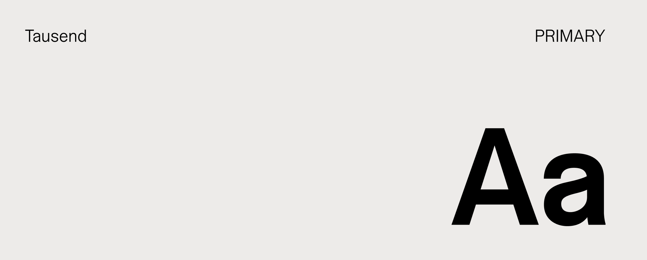
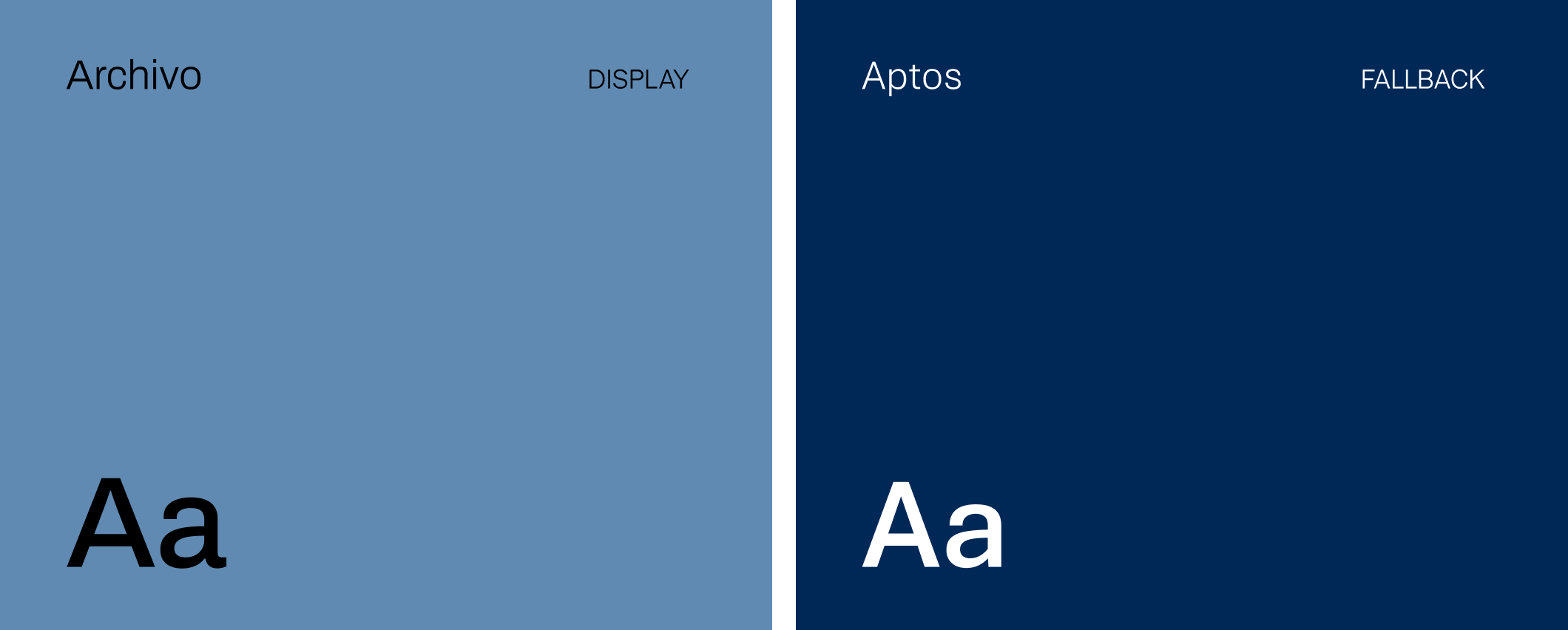
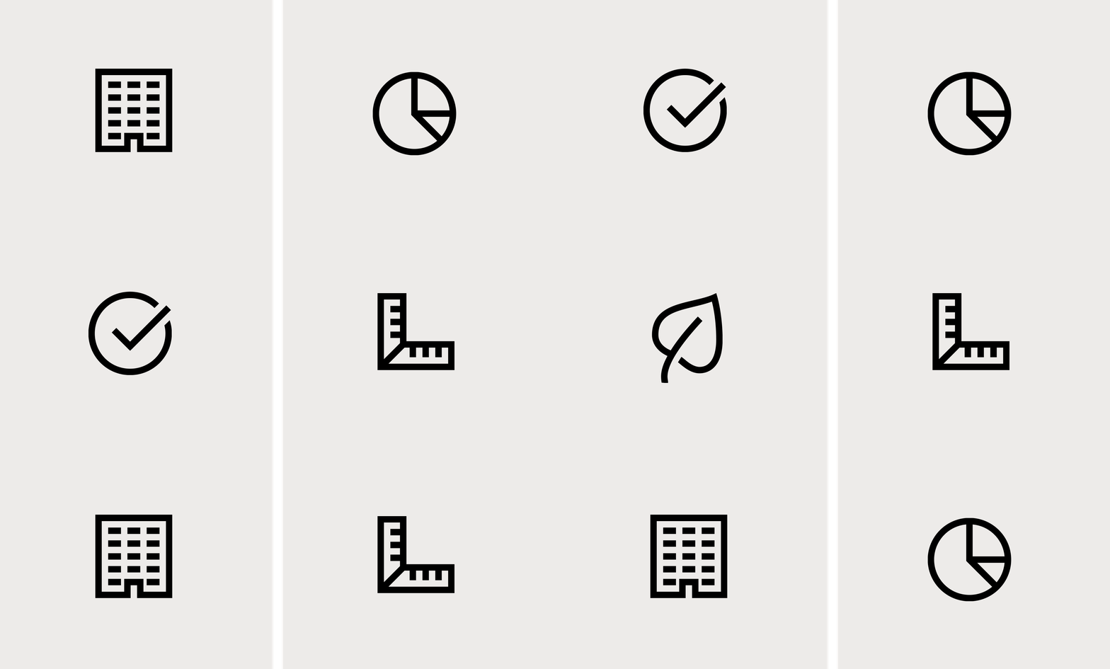
Supporting that are two typefaces: one for presence, one for clarity. And a graphic language that pairs clean linear iconography with timber textures and geometric forms, giving the brand expressive range without losing coherence. Every element was chosen to feel considered without feeling over-designed.
The photography direction reinforces all of it. We defined four visual territories: the texture and grain of the timber up close, the craft and detail of large-scale builds, the collaboration that happens between teams on site, and the sheer scale of the finished work in its urban context.
The system
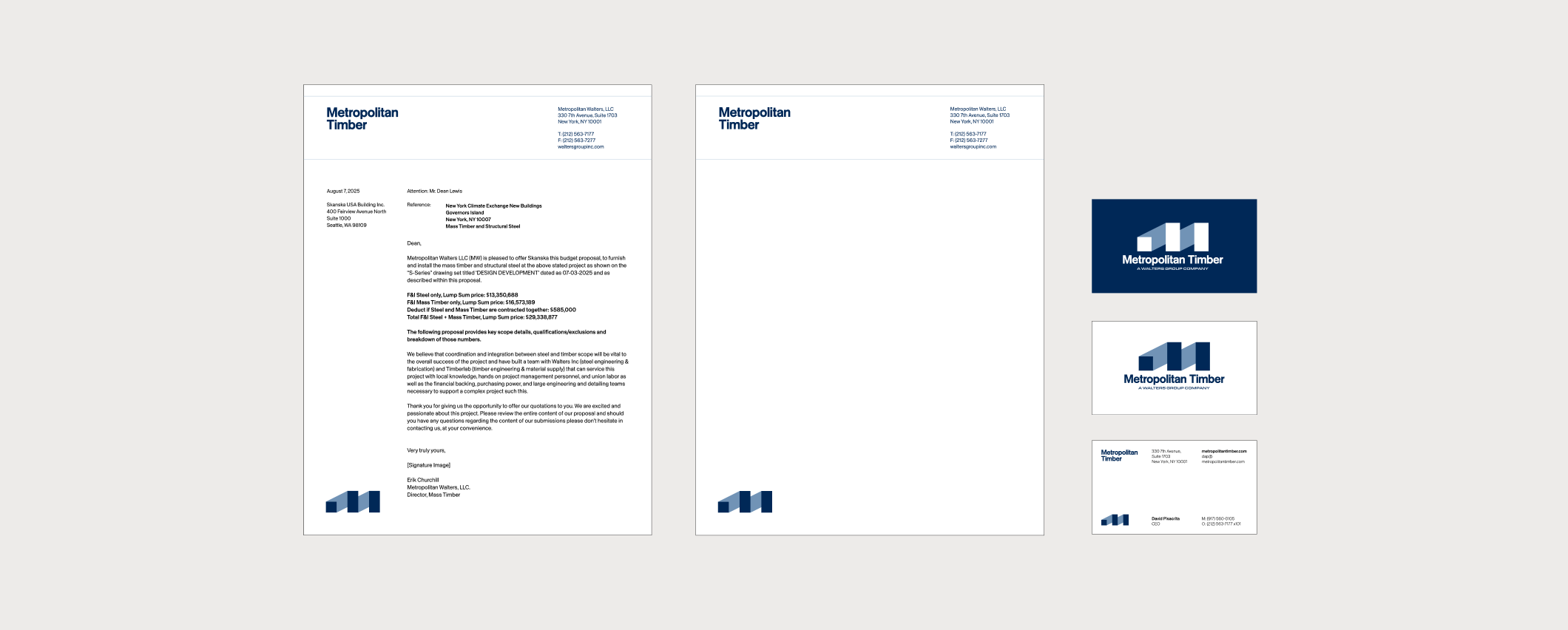
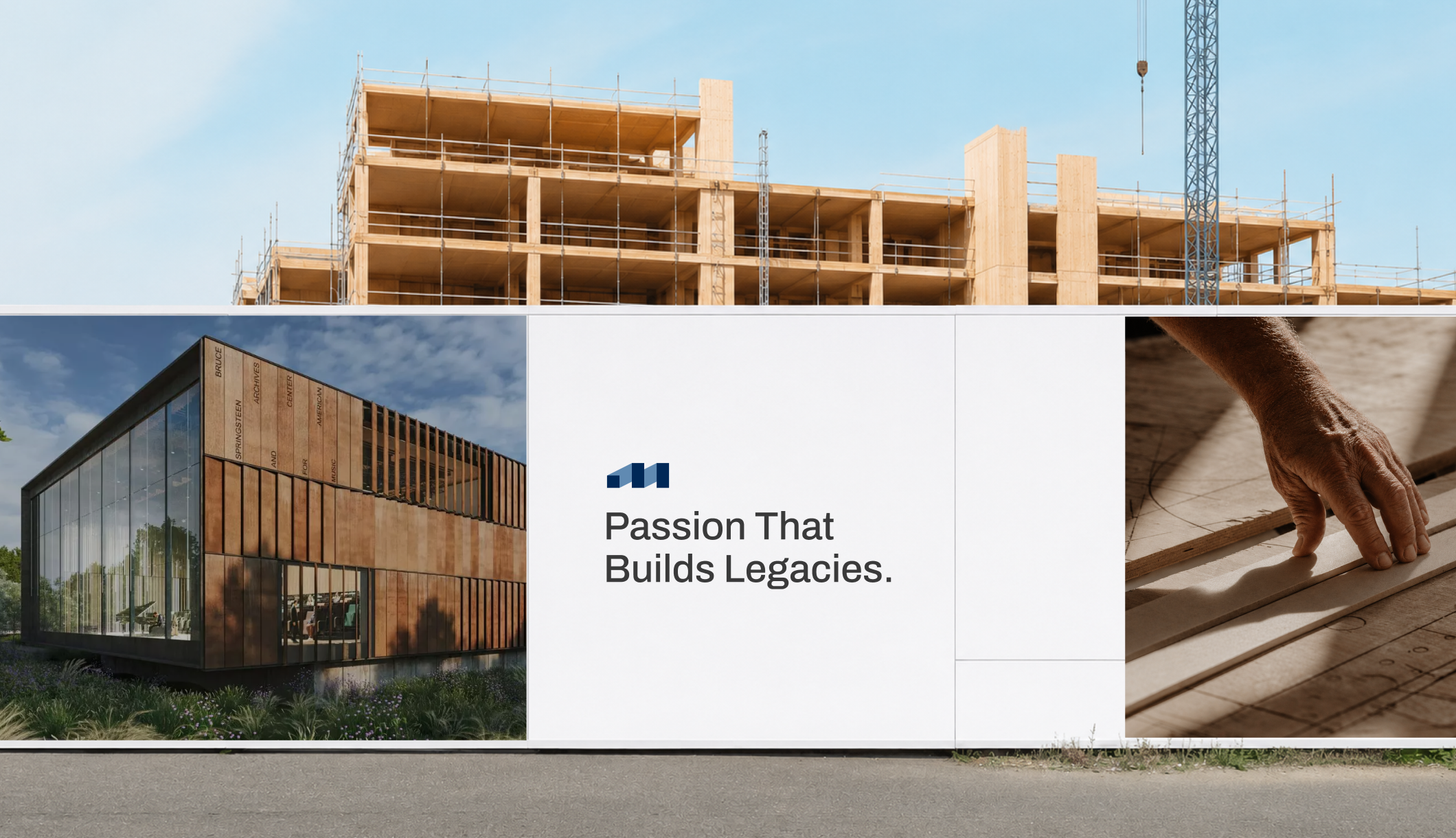
A brand for a company like Metropolitan Timber has to perform across contexts that share very little visual logic. A 44-page specification document. A proposal letterhead. A business card left on a site manager’s desk. A website homepage. A logo on a construction site board visible from the street.
Every element of the system was tested against that range. Nothing decorative, nothing that breaks down at scale. The result is a system that doesn’t need to announce itself. It shows up consistently, and that consistency is what builds trust over time.


Outcome
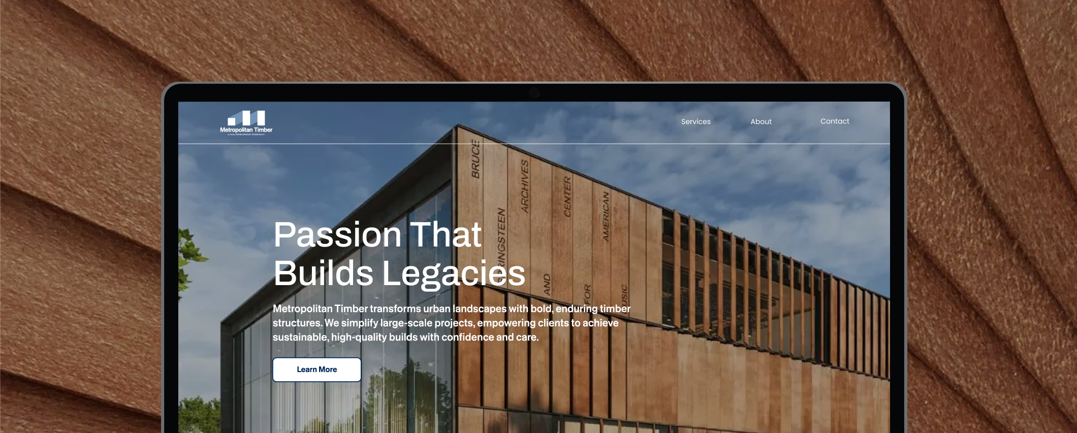
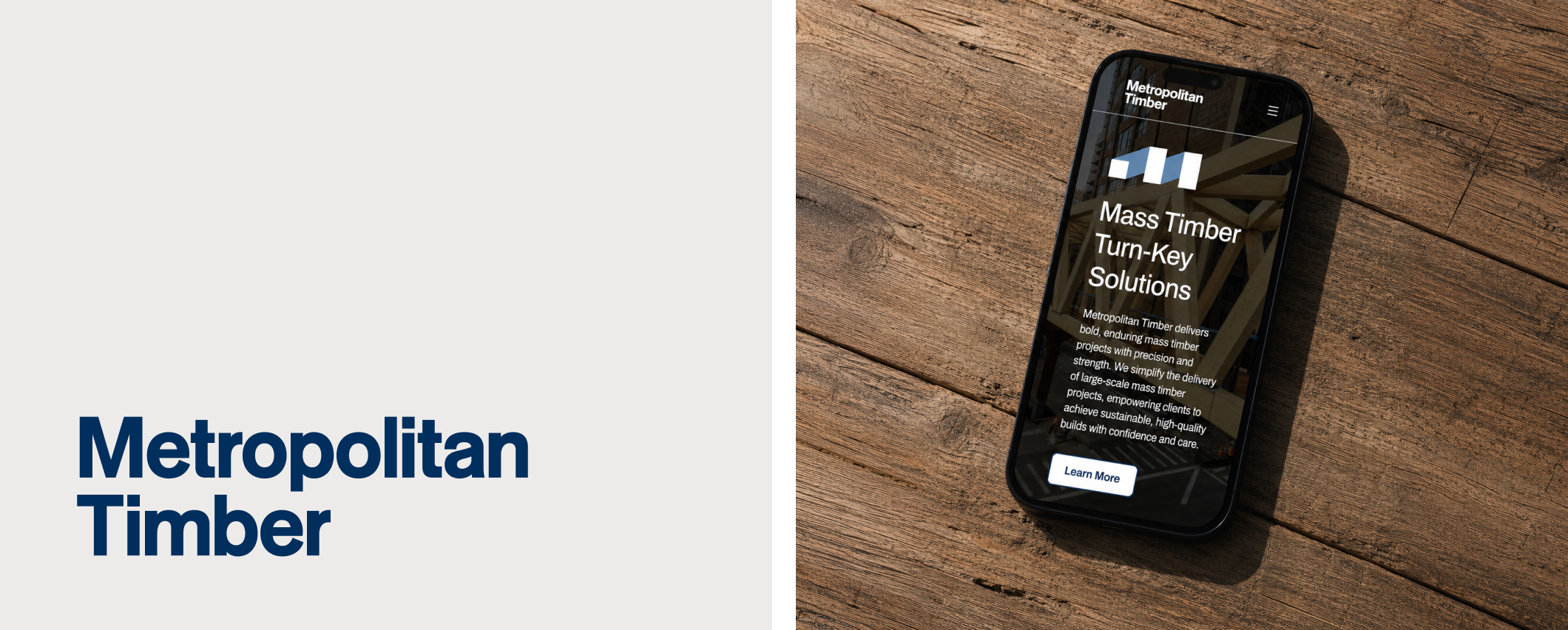
The identity comes to life across the full range of MetroTimber’s presence. The website brings the system into the digital space: Midnight Blue and Sand anchor every page, Archivo headlines set the tone, and the structure stays as clean and direct as the brand itself. It’s a site built to convert, not to impress.
In print, the same logic holds. The letterhead and business cards carry the brand into every formal exchange, from a first proposal to a signed contract. Nothing ornamental. Everything purposeful.
The result is a system that holds together whether it’s being read on a screen, handed across a desk, or seen from across a construction site. That range is what makes it work.