Specialty retail Branding
Flute Center approached Selma Digital to evolve their brand identity, specifically their logo. The Flute Center of New York was changing their name to Flute Center, as they were expanding into cities outside of NYC.
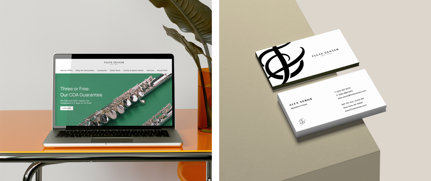
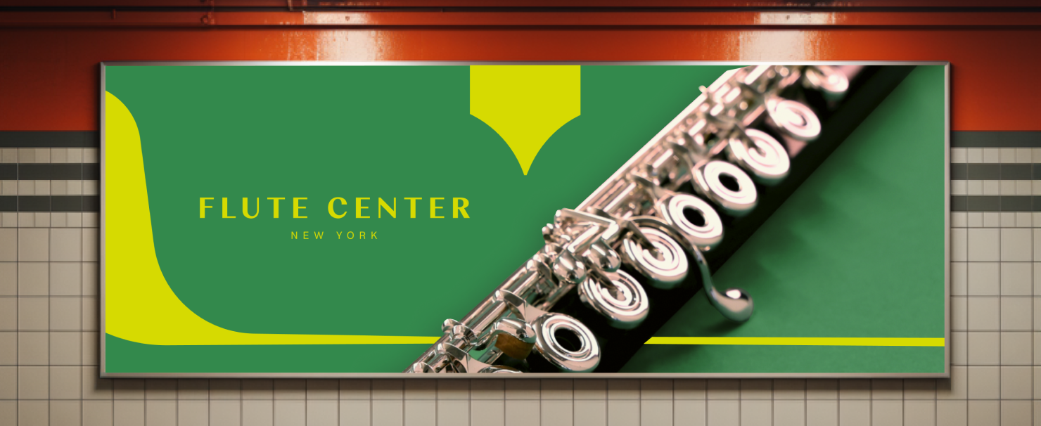
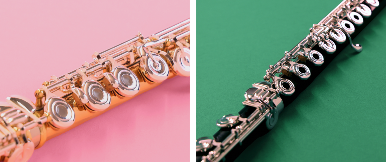
We leaned into the unique spirit of the Flute Center to create a monogram and wordmark pair that felt modern and provided a heritage feel The polished typography, a vibrant color system, and a set of custom graphics all position the Flute Center as a fresh-faced leader in the classical music community.
We’re proud to have won two awards for our work with Flute Center: a Silver International Visual Identity Award and a Bronze Indigo Design Award.
How did you define the brand’s core values, mission, and vision?
In meeting with the Flute Center team to learn more about their organization, we were able to get at the brand’s essence: the best place in the world to purchase your flute. In studying the audience we learned about professionals and students from across the globe, of all different backgrounds and cultures, coming together in their passion for the flute. Ultimately, we wanted the Flute Center brand to reflect the audience – friendly, inclusive, and musical.
What design principles and visual elements informed the new brand identity (e.g., logo, color palette, typography)?
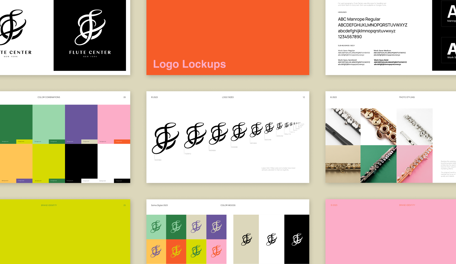
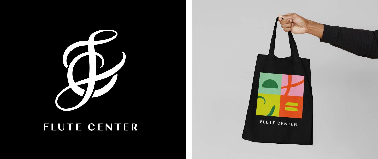
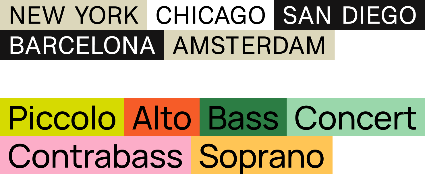
A hand-drawn calligraphic monogram is leveraged to identify with the heritage of the classical music industry and sophistication and practice that is needed to achieve something – like a beautiful musical performance. The monogram is paired with a sans serif wordmark that references the original logo, but set in Weave, the choice is contemporary and modern. Key color pairings with a broader color palette makes it easy for the marketing team to make their communications stand out while also remaining on brand and consistent with the new FC identity.
![]()
How did the visual identity connect to the brand strategy and target audience?
The updated brand and identity was reinvigorated and refreshed the FC brand. We wanted to honor the diversity in the flute community, and the different types of music that flutists can play. Leveraging color and a completely custom mark aligns with the target audience’s aspirations for uniqueness, creativity, and musical passion.


![]()
Deliverables
▪ Logo and Monogram for print and digital
▪ Stationary set
▪ Brand guidelines which include logo usage guidelines, typography system, color system, secondary graphics, and photography
Outcome
Flute Center customers love the brand update, with positive feedback from both customers and industry associates. The logo has also garnered acknowledgment from design organizations, earning industry awards that reinforce the brand’s identity. The brand guideline helps streamline processes, saving the team time and effort. With everyone on the marketing team aligned with these guidelines, content creators and team leads can work together more easily, avoiding delays in asset creation.