
Industry Insights
Elevating Brand Identity through Data Visualization
- WRITTEN BY
- Selma-Rachel Swire
- PUBLISHED
- Oct, 2024


How to employ data visualizations to enhance your product’s brand identity
We create charts, maps, and graphs to help us decipher information and make unique connections. Visualizing data is a very human practice, and your company’s brand is how you connect to your audience’s humanity. In fact, the history of data visualization brings us back to ancient times, where cave drawings were used to record information about hunts or track stars in the sky. These data visualizations became visual stories. And we all know how much people love stories.
Fast forward to today, and we have more data than ever before. The need for data visualization systems in digital products is an ongoing trend, but how do you take your charting package and manipulate it to your advantage, to support your brand’s aesthetic and values? How do you incorporate supporting imagery and iconography to connect with your audience and guide them through the digital experience? For people in the financial industry as well as for everyday consumers, visualizing data is an important part of gaining insight. The data visualization system that accompanies a brand is an important part of the brand’s overall visual toolkit, and a great opportunity to reinforce, elevate, and differentiate the brand from competitors. Here are some things to think about when connecting your data visualizations to your brand.
1. Color Palette
Color palette can have a strong influence over the relationship between the data viz and the brand. The color set can be bold, playful, or muted. These different directions will color (pardon the pun) how a user perceives the brand.
Whatever you choose, keep in mind W3C color contrast recommendations to ensure the shades and hues are visually distinct and easy to see when visualizing data. Think about color use for the types of data you’re displaying as well. This means you may need to think about a categorical color scheme as well as monochromatic palettes. “Alert” color palettes are also important to outline so as to ensure that they are different from the categorical color scheme.
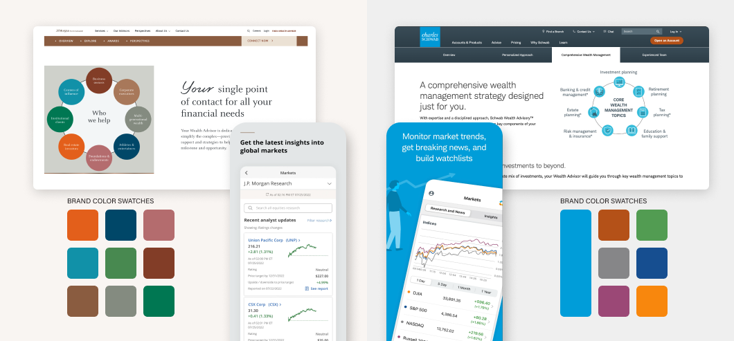
Brand Colors: Use the brand’s main color palette consistently across all visualizations. This reinforces brand recognition and maintains a cohesive visual identity. Notice both Charles Schwab and J.P. Morgan Asset Management (above) use consistent color palettes in their marketing and data infographics. This increases trust and maintains a sense of cohesion.
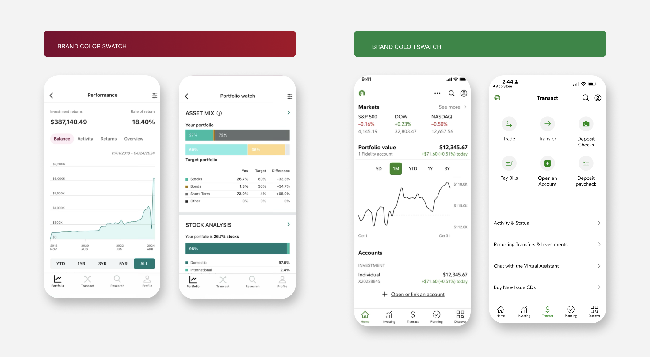
Common colors in the financial world are red and green to communicate gain and loss. But what do you do when the company’s brand color is red or green? How should the infographics be treated and colored? Should the brand color be featured in the visualizations?
See examples above from Vanguard and Fidelity. Vanguard (left) chose to leverage a teal color to compliment the burgendy, creating a professional and trustworthy aesthetic while avoiding both red and green in the visualizations. Likewise, Fidelity leverages black in their app data visualizations. Both Vanguard and Fidelity use their brand color for the UI itself, choosing a complementary color for the visualization. This is a smart, scalable decision that allows the brand color to stand out and align itself with the UI of the product itself.
▪ Differentiation: While both examples shown above are Wealth Management offerings, the color scheme provides distinct differentiation. The dominant blue in Charles Schwab and the dominant brown in J.P.M. make each brand’s infographics distinctly on brand for each organization, though the types of visuals shown (the circle forms) are similar.
▪ Emotional Resonance: The color schemes each give off a different feeling, while both are communicating professionalism. The left color set is brighter and slightly more playful. The palette pairs well with neutral grey and dark blue steel colors, making the playfulness a little more grounded. Each color is also distinct, which is great for categorical color palettes. The color palette on the right has a more moody, earthy feeling, with warm brick and rose colors. This warmth pairs well with beiges and cream tones, evoking a sense of quiet luxury. Each palette works to add feeling and emotion to the brand.
2. Typography
How you employ labeling and legends, the size and color of your fonts, whether you use a default font or a custom font, will all relate to your audience’s reading of the data visualization and its relationship to your brand. Ensuring the font has a consistent system for titles, labels, and annotations will improve professionalism and trustworthiness. Carefully consider your alignment and spacing to ensure the data is reading easily and clearly.
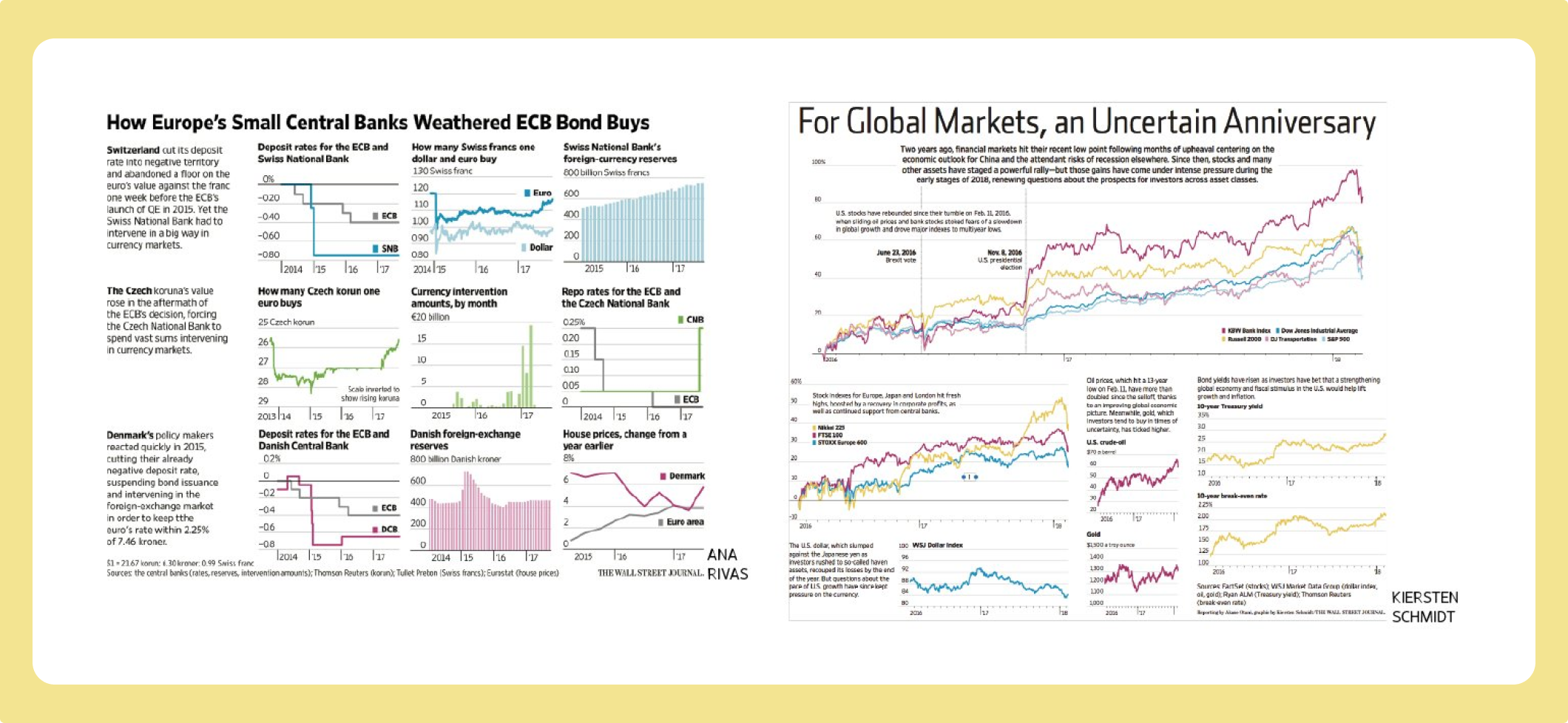
In the examples below, we see the detailed labeling and contextual text that tells detailed narratives in data visualizations from the Wall Street Journal. For comparison, we can see mobile views of Wealthfront, Investopedia, and Wise. The density and amount of annotation aligns with what the customer wants to know as well as what the company wants the customer to know. This creates a direct relationship between value, utility, and style.
3. Style
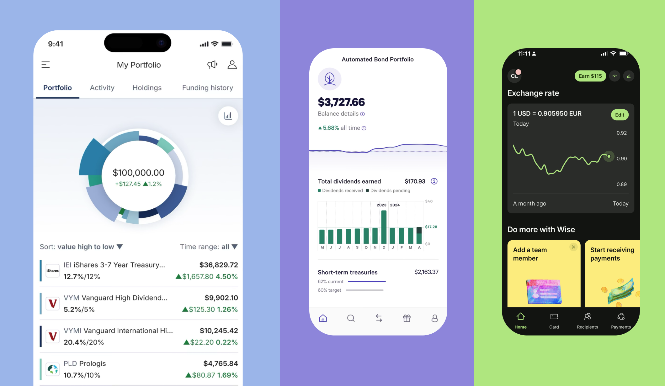
Chart styling is a great opportunity to think about how all of the details add up to create a more holistic picture. Is the chart on a grid? How do we use tick-marks in the X or Y axis? Are the curves in the line chart smooth or highly detailed? All of these questions should be thought through in relation to who the audience is, what the data is communicating, and how you want your brand to be perceived. In the three app screens above, specific style choices relate to the brand and the story that the visual is communicating. The left app screen presents a pie chart of the customer’s portfolio, holdings, performance, and change. The cool blue tones and unique pie chart present itself as professional and detailed. The pie chart’s unique form is memorable and style provide differentiation from other apps. In the center, the purple performance curve is both informational and decorative, breaking the page into a white top and light purple bottom. There is no labeling around the performance, or even exactly what the dotted line represents. It it’s use as a design device and a chart make it feel cool and smart. The bar graph below the line graph is extremely clear with axis labels, numeric call-outs, and a color key. A supporting bar graph with current versus target goals is shown. In one very cleanly designed screen, the viewer is told a lot of information using a few different techniques. There is a great balance of information and white space, which makes the app feel very modern.
On the right, the green exchange rate curve is stylized with it’s soft curves. Because it doesn’t tell the viewer much, it serves as a large spark line, But the color feels really trendy, and the calls to action beneath also make the app feel fun.
In these three examples we see how the style of the chart and the way it communicates information can influence the customer’s brand perception.
4. Storytelling
What is the personality of the brand and tone of the communication? What is the relationship between the different types of data on the page, and what larger story does it tell? What affordances, if any, allow the viewer to manipulate the data and tell a new story? These questions will help guide the visual tone, complementary communications, and data pairing that is presented in the application.
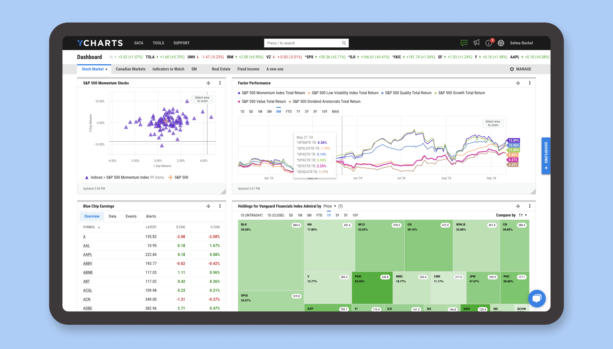
In the YCharts Dashboard below, YCharts has pre-created a set of custom dashboards that each tell a unique data story, ready for the customer to leverage for research and analysis. The relationship between S&P Momentum Stocks, Factor Performance, Earnings Data, and Holdings Heatmap create a unique visual story and view into market performance. Additionally, each type of chart is selected to pair with and visually optimize the data story we need to communicate.
5. Interactivity
Interactivity can complement the data that’s presented, provide additional context and insights, or allow the viewer to chart their own course. Once interactivity is incorporated into data visualization, storytelling can get more interesting and specific.
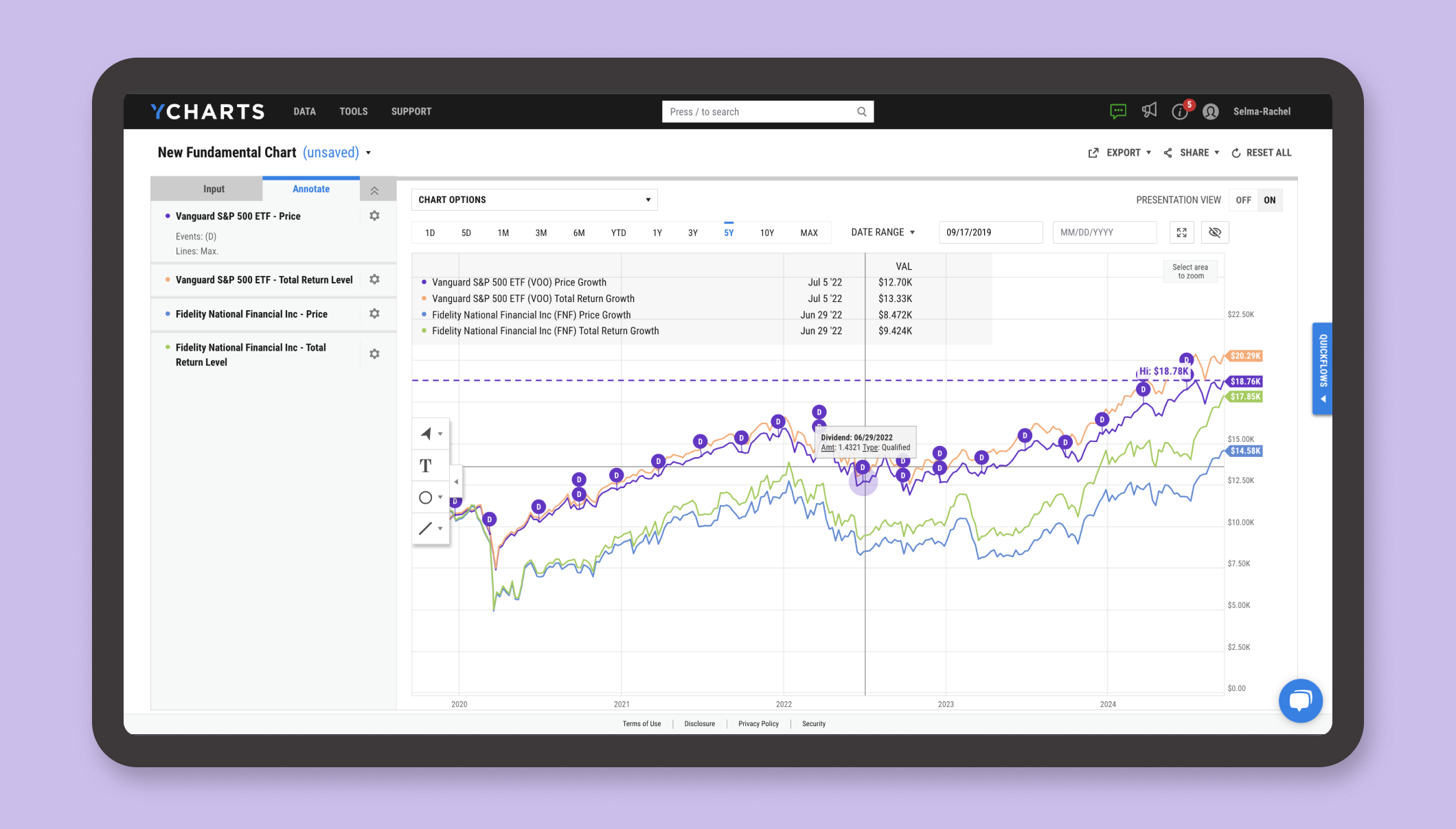
In YCharts, many of the infographics offer hover states with contextual information. Within the Charting tools, the interactivity is even more pronounced as practically every element within the chart can be customized, as shown above. Allowing the interface to sit in the background with neutral grays and whites makes the data and information the most important elements on the screen.
6. Complementary Imagery
When you need to compliment the data visualizations you’ve designed with button affordances, iconography, or compel viewers to take action in your application, it may be important to consider complementary imagery. Visuals and iconography have a significant opportunity to drive brand voice and create a strong statement. Be sure to consider the subject (what’s in the picture), how it is communicated (the story of the picture), as well as how the image is rendered (the style). Each choice will affect the brand. No matter what your stylistic direction, be consistent in how you use and style imagery. This helps maintain trust and signify financial stewardship, which are important qualities in the financial space no matter your brand.
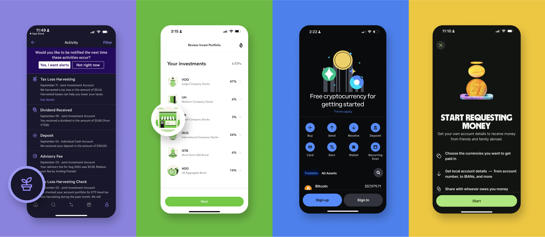
Below are examples of unique iconography and complementary imagery that are part of the financial app experience. From simple to illustrative to conceptual to tie-die 3D graphics, each app has unique complementary imagery to express the brand.
6. Uniqueness
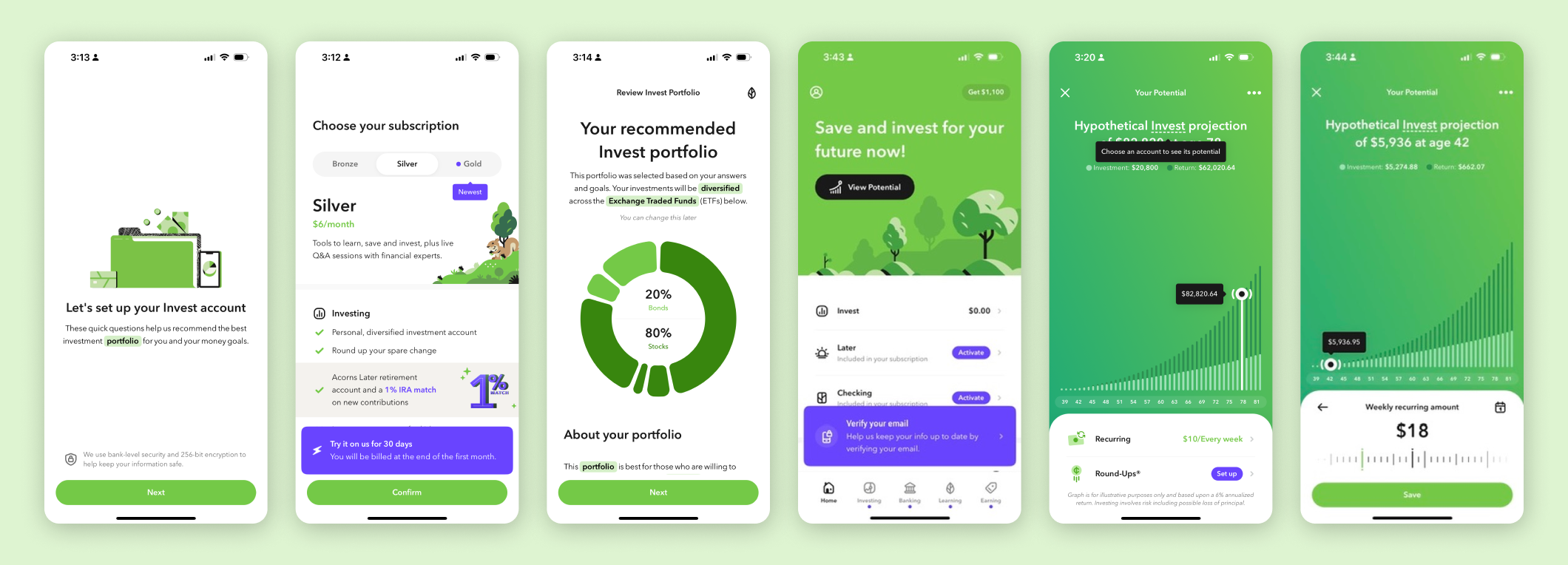
Being unique can mean being memorable, being supremely easy to use, or providing value that is not found anywhere else. One of the most memorable consumer financial experiences I’ve had lately is captured below. The UX flow was extremely straightforward. The data visualizations communicated quickly. The complementary graphics are beautiful. But most of all, the app provided a sense of promise for the future in one interactive data visualization. That sense of promise was what convinced me to invest with this app’s product. Understanding user psychology, the verbal and visual communication, as well as the creative data storytelling are all contributing factors that add up to this app’s successful user experience.
If you’re ready to amplify your product’s brand voice using data visualizations, contact Selma Digital. We’ll work with you to strategize creative, compelling, and smart ways to make your product’s customer experience even better. Contact us today for a complimentary brainstorm.

